Looking good at any (font and window) size

Make your layout look good a different screen and font sizes.

What it looks like

Example 1,
Example 2.

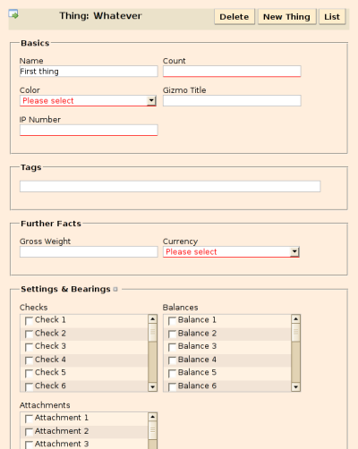
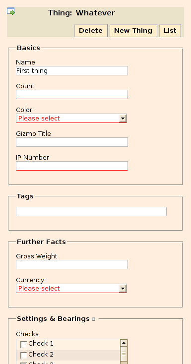
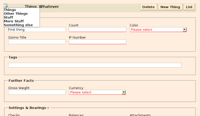
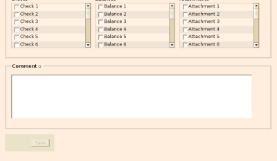
Here’s what the form example (example 1) is supposed to look like.

At 1024 x 768 pixels, the navigation links and Save button are positioned fixed in a column to the left.

large layout

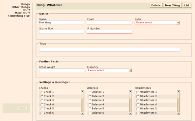
At 800 x 600 pixels, the navigation links are only shown on hover over the icon in the top-left corner; the Save button is tucked under the form itself.

large layout
large layout

What you need

Grab layout.js.

You also need Prototype.js.

What you need to do

Include the scripts in your page.

<script src="javascripts/prototype.js" type="text/javascript"></script>
<script src="javascripts/layout.js" type="text/javascript"></script>

Activate layout switching in the head of your page

<script type="text/javascript">
//<![CDATA[
Event.observe(window, 'load', function() {
  Layout.initialize({observeFontSize: true});
});
//]]>
</script>

Most likely, the default size thresholds set in layout.js won’t fit your needs. See the file itself for how to set them to different values.

(Re-)Write your stylesheets so that they make use of the size information. As an example, here’s the CSS I use for styling the navigation list on the two example pages.

#navitrigger {
  display: none;
}

#navigation {
  position: fixed;
  top: 0em;
  left: 0em;
  margin: 1em;
  padding: 0;
  text-align: right;
  z-index: 10;
}

#navigation ul {
  width: 10em;
  margin: 0;
  padding: 0;
  list-style-type: none;
}

#navigation li {
  font-weight: bold;
}

#navigation .current {
  display: block;
  width: 100%;
  color: #bbb;
  background-color: #ffecac;
}

#navigation li.admin {
  border-top: 1px solid #bbb;
}

#navigation li a {
  display: block;
  width: 100%;
}


body.small #navigation {
  position: absolute;
  text-align: left;
  z-index: 30;
}

body.small #navigation ul {
  display: none;
  background: #fff;
  border: 1px solid #888;
}

body.small #navitrigger {
  display: block;
  font-size: 150%;
  font-weight: bold;
}

body.small #navigation:hover ul {
  display: block;
}

Return of the Tag Cloud — ajaxing the tagged

On my continuing quest to become more Web-2.0-ish, I’ve tried my luck tilting at… well, tag clouds. To get an idea what I’m talking about, please have a look.

These are the rudimentary basics to create a tag cloud like that.

In the controller

def tags
  @popular_tags = Tag.find_most_popular(:limit => 30)
end

In the view

<ul id="tags" class="tagcloud">
<% @popular_tags.sort_by(&:name).each do |t| -%>
  <%= weighted_tag t, tag_options %>
<% end -%>
</ul>

or, to get a somewhat nicer look, and to demonstrate some of the options

<%
  tag_options = {
    :wrap => ['li', '<span class="dlm">[</span>', '<span class="dlm">]</span>'],
    :min_size => 100, :max_size => 500,
    :link_options => { :class => 'tag' })
  }
-%>
<h2>Tags</h2>
<ul id="tags" class="tagcloud">
<% @popular_tags.sort_by(&:name).each do |t| -%>
  <%= weighted_tag t, tag_options %>
<% end -%>
</ul>

Here you can download a do-it-yourself kit of all the pieces.

Form Layout

I’ve looked at quite a lot of examples of form layout over the past two years. Invariably the demonstrations looked very pretty and were pretty primitive. Usually, all the input elements are lined up in a single column; labels are either stuck on top of the inputs or prepended to them. This is all well for simple forms or a succession of forms chained together in wizard-style. It is less appealing for web-based applications targetted at proficient users who interact with them frequently.

Ground Rules

  • Tables only where they are semantically meaningful.
  • As much independence as possible from specific window or font sizes.
  • Efficient use of available space.
  • Horizontal and vertical alignment to columns.

Here’s my entry.

For those with impaired browsers, here’s what it looks like at various widths.

800 pixels
large layout

600 pixels
large layout

400 pixels
large layout

The relevant part of the boilerplate.css stylesheet isn’t even overly long.

Posted in CSS