
I’ve looked at quite a lot of examples of form layout over the past two years. Invariably the demonstrations looked very pretty and were pretty primitive. Usually, all the input elements are lined up in a single column; labels are either stuck on top of the inputs or prepended to them. This is all well for simple forms or a succession of forms chained together in wizard-style. It is less appealing for web-based applications targetted at proficient users who interact with them frequently.
Ground Rules
- Tables only where they are semantically meaningful.
- As much independence as possible from specific window or font sizes.
- Efficient use of available space.
- Horizontal and vertical alignment to columns.
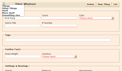
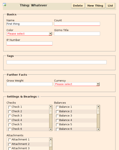
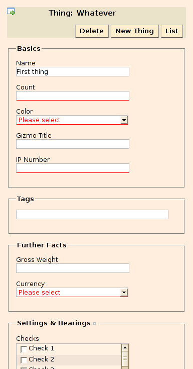
For those with impaired browsers, here’s what it looks like at various widths.
800 pixels
600 pixels
400 pixels
The relevant part of the boilerplate.css stylesheet isn’t even overly long.